Andean Viewpoints — a Coppermont newsletter
Landing Page Explorations
Nine answers to the same brief: a landing page for a free newsletter covering Peru, Ecuador, Bolivia, and Colombia. The copy was fixed, the constraints were fixed, and no design system was shared. What differs is the position each version takes.
- Subject
- Andean Viewpoints, a free letter from Coppermont
- Coverage
- Peru · Ecuador · Bolivia · Colombia
- Cadence
- Two to three issues a week
- The exercise
- Same copy, same constraints, no convergence
- Entries
- Nine built
- A note on the index
- Each entry’s name is set in the typeface of its own version; thumbnails open full-page screenshots
-
01
 Full page ↗
Deepseek Viewpoints
Deepseek
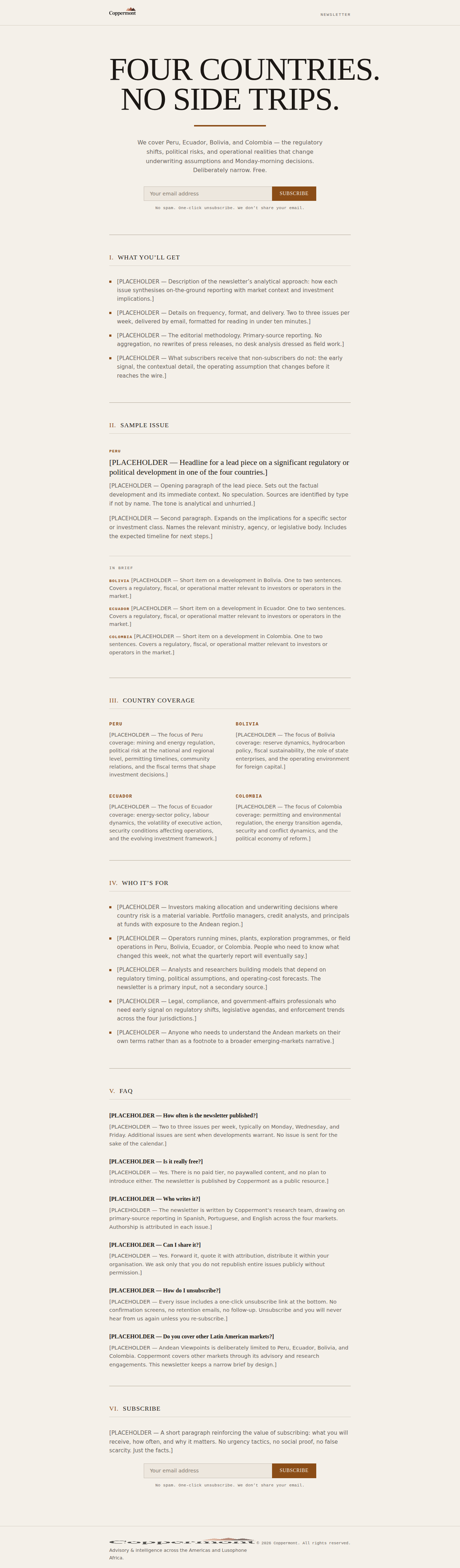
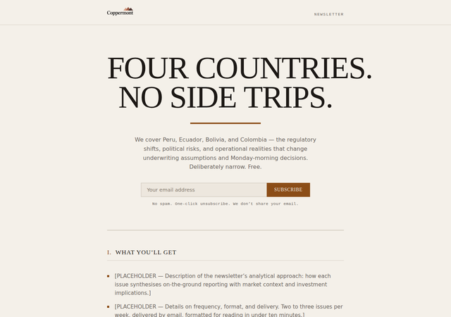
A numbered government bulletin. All-caps Georgia at 6rem with negative tracking. Rules do the work of hierarchy. Roman numerals mark each section like articles in a legal code; Courier New country tags read as field dispatches.
-
02
 Full page ↗
Andean Viewpoints
GLM — first pass
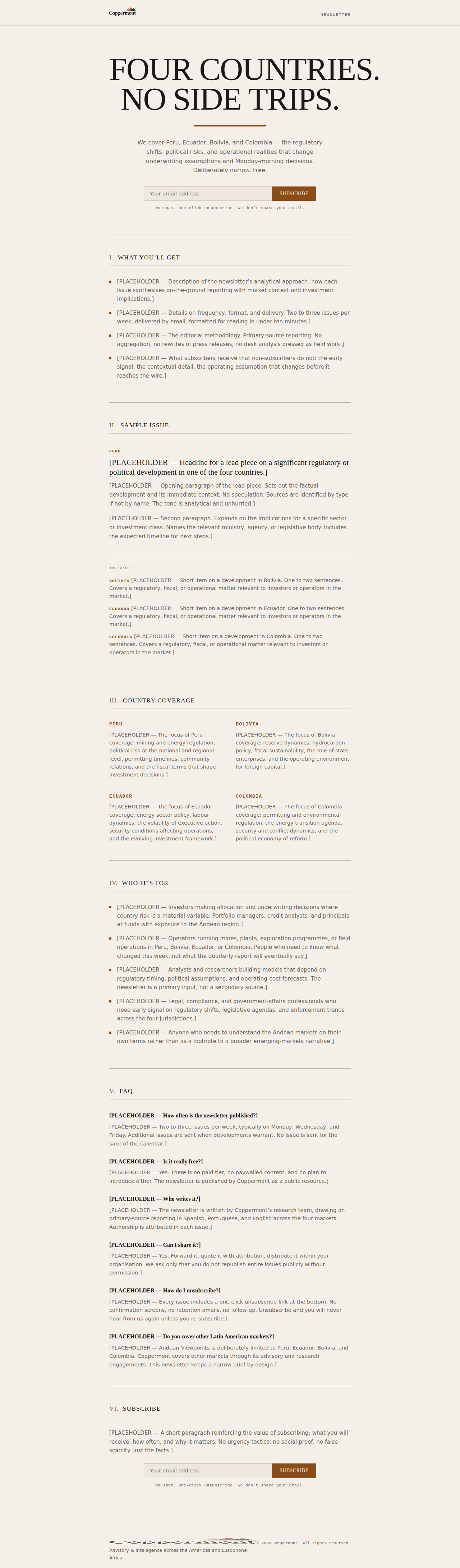
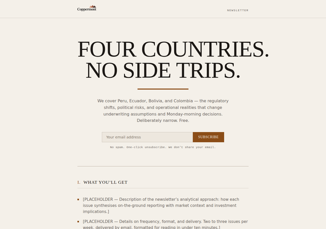
The numbered-bulletin build taken as a starting point — the same monumental all-caps Georgia, the same cream stock and rule system — with the engineering layered on top: an enhance.js that adds inline validation, an async submit with a native-POST fallback, and honeypot interception. The design position is inherited; the progressive enhancement is the contribution.
-
03
 Full page ↗
AV
GLM — second pass
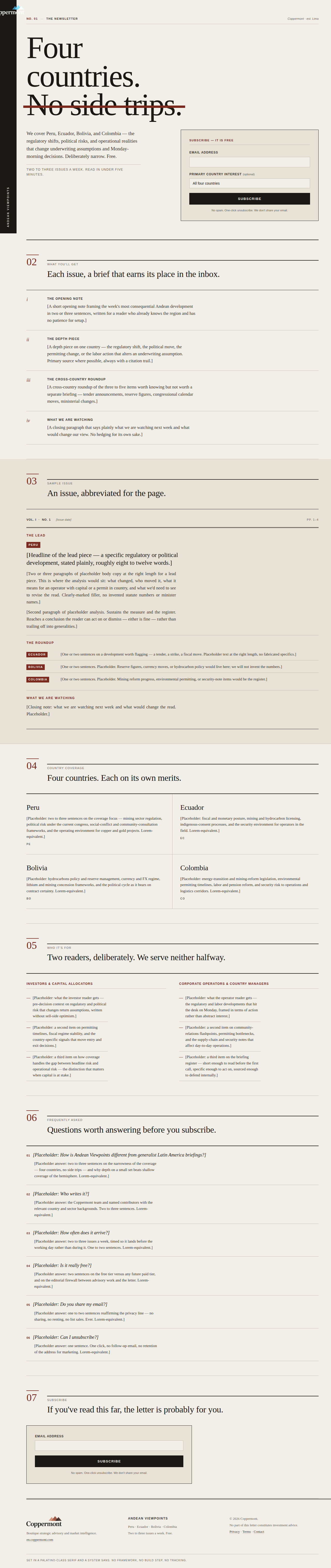
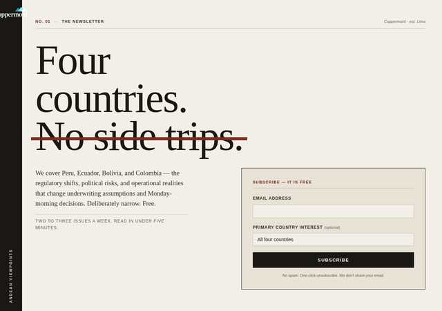
A vertical masthead spine. The Coppermont wordmark runs rotated down the left edge as the structural axis of the page; everything else hangs off it. Palatino-class serif for reading, Helvetica reserved for folios, stamps, and labels, and every element catalogued with numerals — a bound report, not a landing page.
-
04
 Full page ↗
Bulletin
Minimax
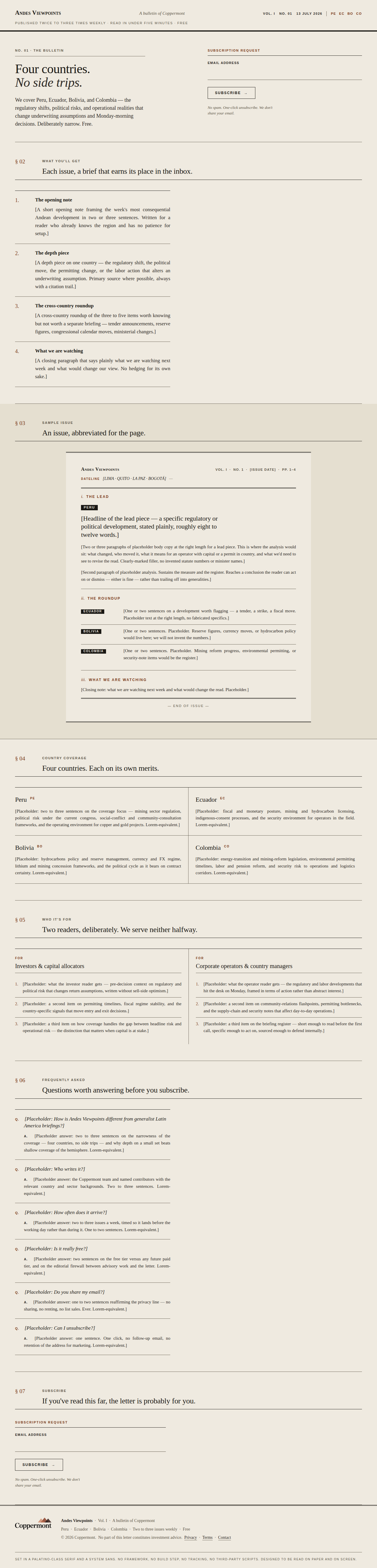
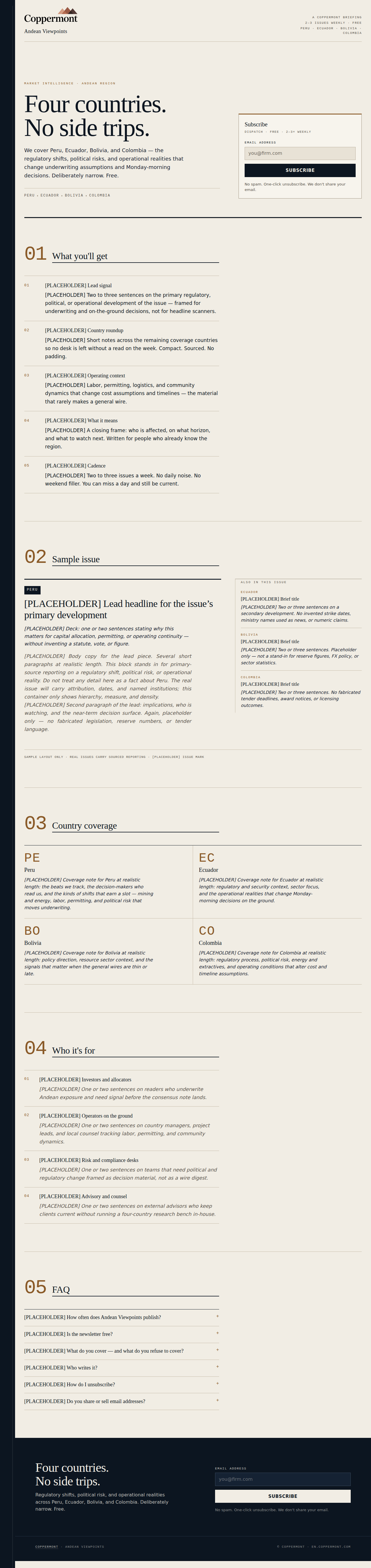
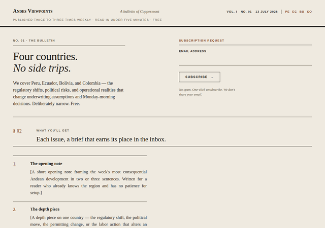
The inversion of the room. A quiet two-and-a-half-rem headline, its second line in italic, and a single 4px rule across the full width carrying the page’s authority. Palatino for reading, sans for the §-coded apparatus. Annual-report register — a publication, not a campaign.
-
05
 Full page ↗
Kimi Viewpoints
Kimi
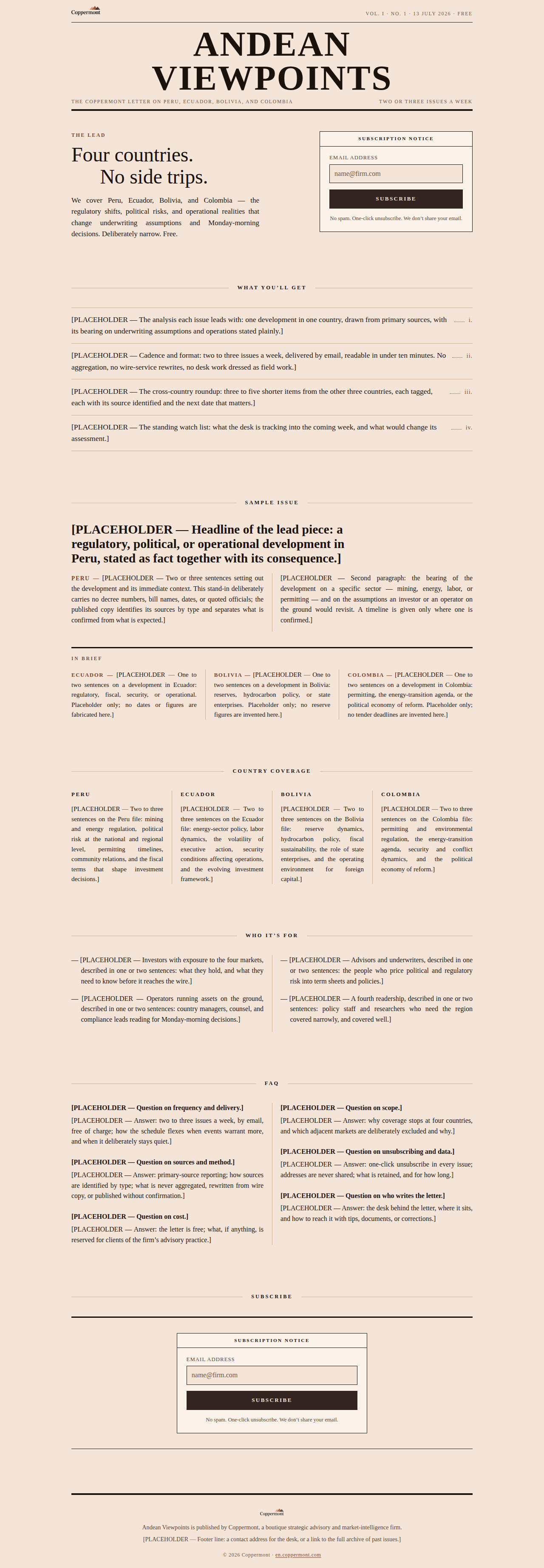
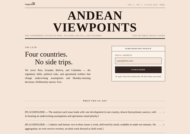
The front page of a newspaper of record, printed on copper-tinted stock taken from the logo’s own triangles. The nameplate is the largest type on the page — the publication outranks the story — and every column is justified and hyphenated. Set entirely in Times New Roman, on purpose.
-
06
 Full page ↗
Qwen
Qwen
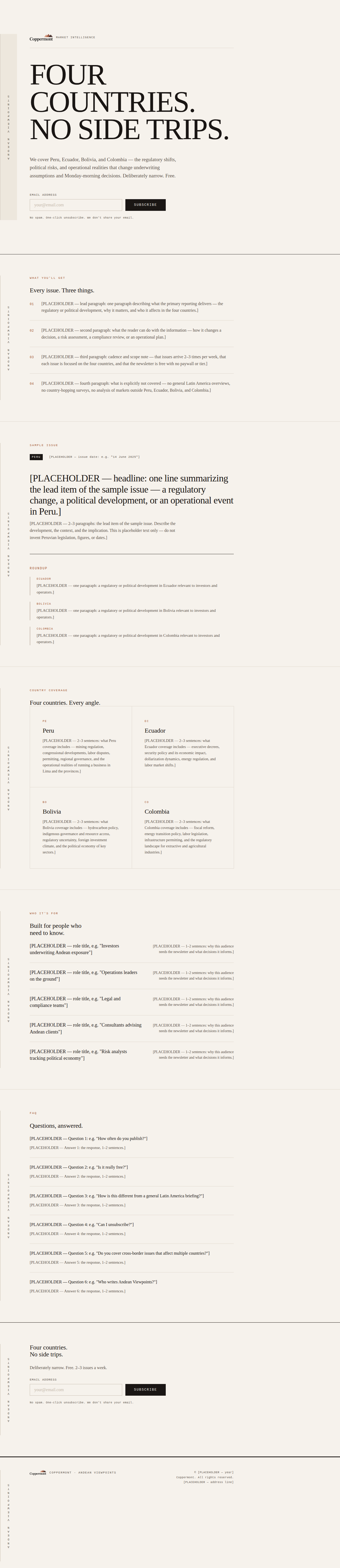
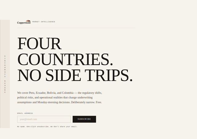
A dispatch board. A vertical rule splits every section: a narrow left rail carries the newsletter name, rotated, running the full height of the page, while the right column holds a rigid content grid. Georgia with Courier accents and a hero headline up to 7.5rem. The masthead is not a header — it is the spine of every section, committed to all the way down.
-
07
 Full page ↗
Grok Viewpoints
Grok
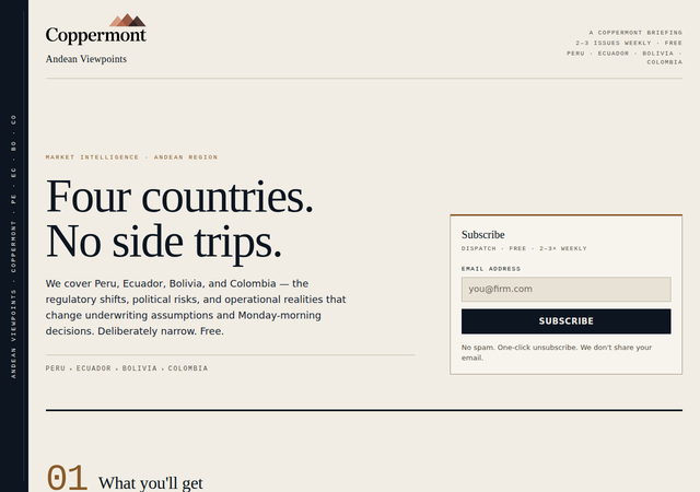
A gazetteer spine. A permanent ink band on the left edge carries the publication name set vertically, like a survey volume or a ship’s log, and steals width from every section on purpose. Georgia for display, system-ui for body and forms as a deliberate bureaucratic circular, Courier for meta and indices; section indices run three-and-a-half to four-and-a-half rem as structural numerals.
-
08
 Full page ↗
Sonnet Viewpoints
Sonnet
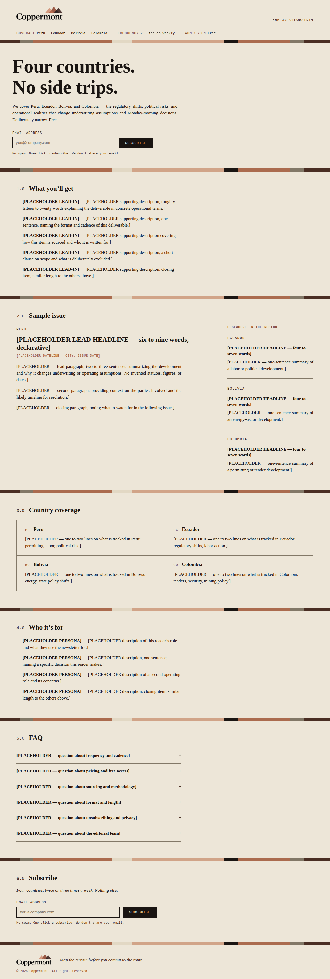
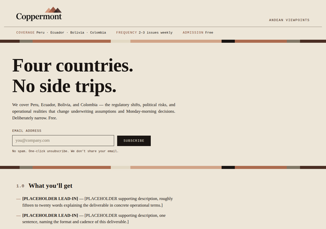
A core sample, not a pitch. One device — a banded stratigraphic rule cut from the logo’s own copper gradient — replaces every rule and section break, so the four countries read as a cross-section you descend through rather than a scroll you skim. Cambria for reading, Courier for the instrument voice; body at 17px, the hero headline past 90px, nothing competing in between.
-
09
 Full page ↗
Trinity Large
Trinity Large
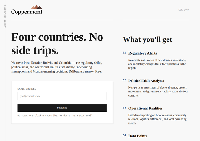
Institutional typography as the only visual element — a geological survey or a central-bank bulletin where type alone builds the hierarchy. Georgia with Courier New data elements, a massive 6rem H1 against tight 1.4 body leading, and a vertical masthead rule running the full height of the page for permanence.